The importance of customization. The workplace today is far more complex than it was before Covid. WFH ahs resulted in complex communication structures, behavioural shifts in how meetings are conducted and how employees engage.
An Arcus survey of 40 workplace behavioural psychologists found that the power of customization of how employees work and communicate hasn’t been more important. In response, Arcus has developed a program to help clients become more responsive to employee needs in regard to work structure and productivity. The process has significantly augmented Arcus’s change management offering to clients by integrating a highly responsive model that employees feel demonstrates that their needs are being heard.
What does customization mean in the workplace?
It means that the future of work will require employers to understand HOW employees want to work and serve them more customized work structures to increase productivity. Examples include customized work hours, meeting formats, communication methods and more. Today most of this is defined top down by the organization.
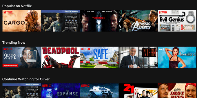
Here is an example of the power of customization in an entirely different context (Netflix interfaces)- with a similar underlying concept: customization engages people far more because they are served information and structures that encourage desired behaviour patterns and responses.
A Netflix user will browse the app for 90 seconds and leave if they find nothing. Thumbnail artwork is actually NFLX’s most effective lever to influence a viewer’s choice. A user will look at one for only 1.8 seconds, so NFLX spends huge to optimize them.
1. humans are visual animals.
Our eyes move 3-4x per second to process information and we can analyze an image in as little as 13 milliseconds. In 2014, Netflix consumer research showed that thumbnail artwork:
- White medium square is “the biggest influencer…to watch content”
- White medium square is the focus of 82% of browsing time

2. A user looks at one for only 1.8 seconds. If they can’t find Netflix content in 90 seconds, they’ll leave the app.
Consequently, Netflix uses an elaborate thumbnail selection process for each of its 200m+ users. The process is called aesthetic visual analysis (AVA), which starts by pulling all the frames from a video. For reference: a 1hr episode of “Stranger Things” has 86k frames.
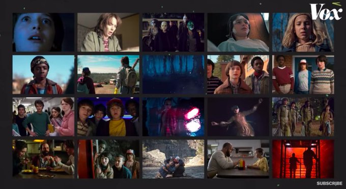
3. In a process known as “Frame Annotation”, each frame is tagged with metadata identifying key variables:
- White medium square Saliency
- White medium square Frame #
- White medium square Brightness / Contrast
- White medium square Nudity probability
- White medium square Face / skin tone
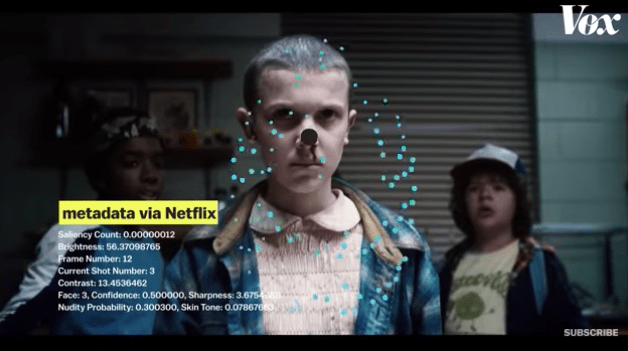
4. The frames are then graded on these variables.
- White medium square Visual (brightness, contrast, color, motion blur)
- White medium square Contextual (face detection / shot angle)
- White medium square Composition (photography principles like “rule of thirds”, symmetry, depth of field)

5. The next step is “Image Ranking”, which chooses the best thumbnails (most likely to be clicked).
- Winning traits include:
- White medium square Expressive faces
- White medium square Main characters
- White medium square Brightness
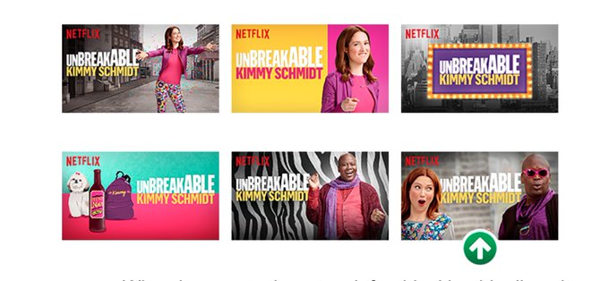
- For “Unbreakable Kimmy Schmidt”, Netflix research showed the bottom right frame as the “winner”.
6. Optimized for the streaming app
One reason Netflix started creating its own thumbnails is that the artwork provided by studios weren’t optimized for the streaming app. The creative work Netflix received was meant for other mediums like billboards or DVD covers.
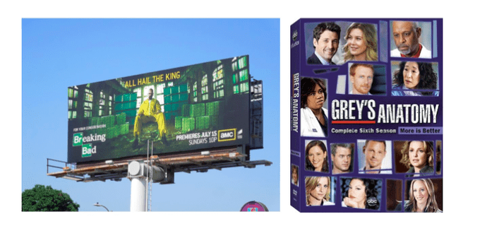
6. One last finding
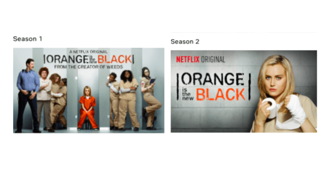
Netflix discovered that thumbnails with more than 3 people vastly underperform. Netflix applied this knowledge for the rollout of “Orange Is The New Black”. Season 2 has only one character in the thumbnail (vs. an ensemble for Season 1)
